How The Sausage Gets Made (Sketch to Final Drawing)
Good morning, loves!
Today I want to show some of my behind-the-scenes process.
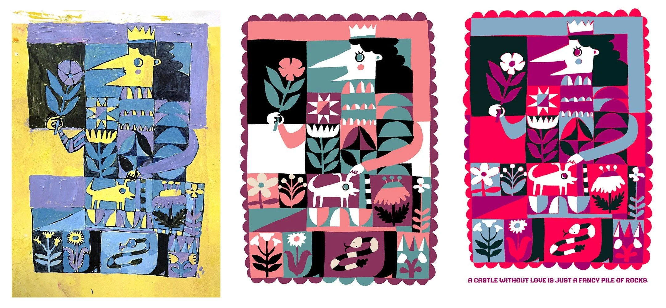
Let’s see how something evolves from doodle to draft to done!
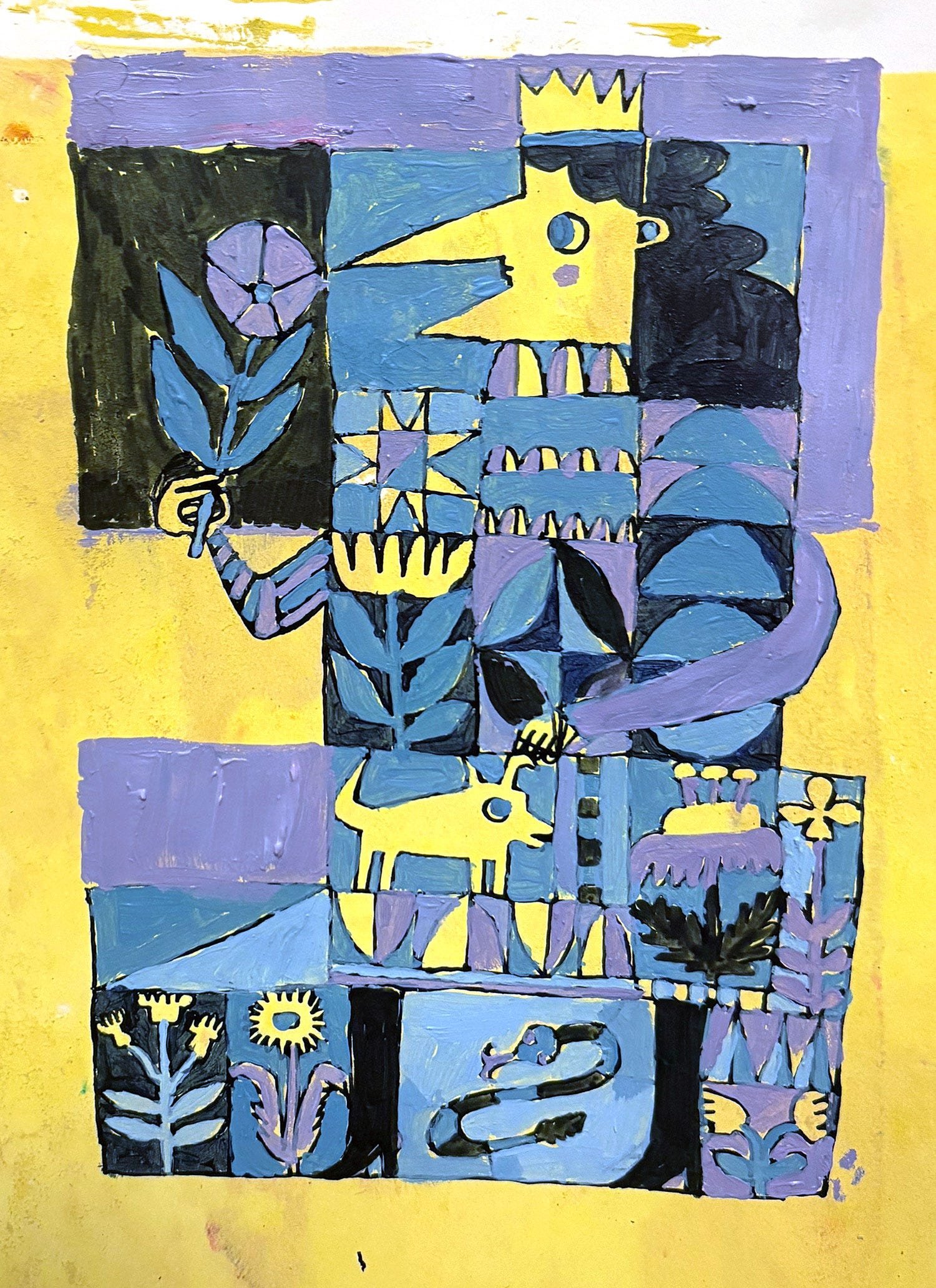
Doodle Facts:
99% of my drawings are done by hand first.
Almost every page of my sketchbook has messy backgrounds. It feels good to lay something down so making marks isn’t as intimidating.
Drawing with a dip pen on a smooth surface (like painted acrylic) is so pleasing.
It doesn’t matter if your grid-lines are straight, you can fix them later or honestly just leave them. Who cares!
Same with smudges or weird shapes. This is the first draft and the specifics don’t matter until:
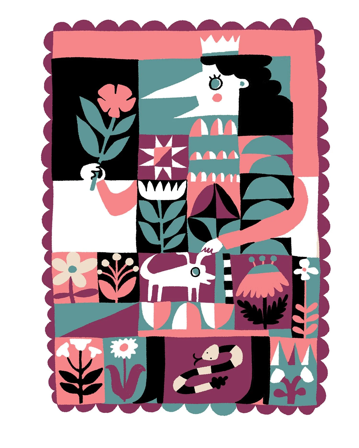
Digital Draft Facts:
If you hated your draft palette, this is your chance to try new colors! That’s fun.
You can now copy-and-paste! Your shape can become a pattern! You can swap areas!
You can now decide if you’re going to straighten things or clean up lines.
Which leads to:
Digression about Manual to Digitization:
My guess is that everyone hates AI so much that some of this “cleanup” phase is going to be truncated.
Before AI, having a clean image meant you were really good at your craft. Now, smooth images are the boring default. Artists are going to leave wobbly lines and random pieces of residue and texture and mistakes to show that they were there.
There are artists that work by hand, scan it up, and don’t Photoshop it to bits.
I feel like my work is only “finished”/”client-ready” after I’ve more or less re-created it digitally.
But that might change as AI becomes more prevalent. Society’s aesthetic might come all the way to where my raw drawings are. That’d be lit.
Moving on to Done!:
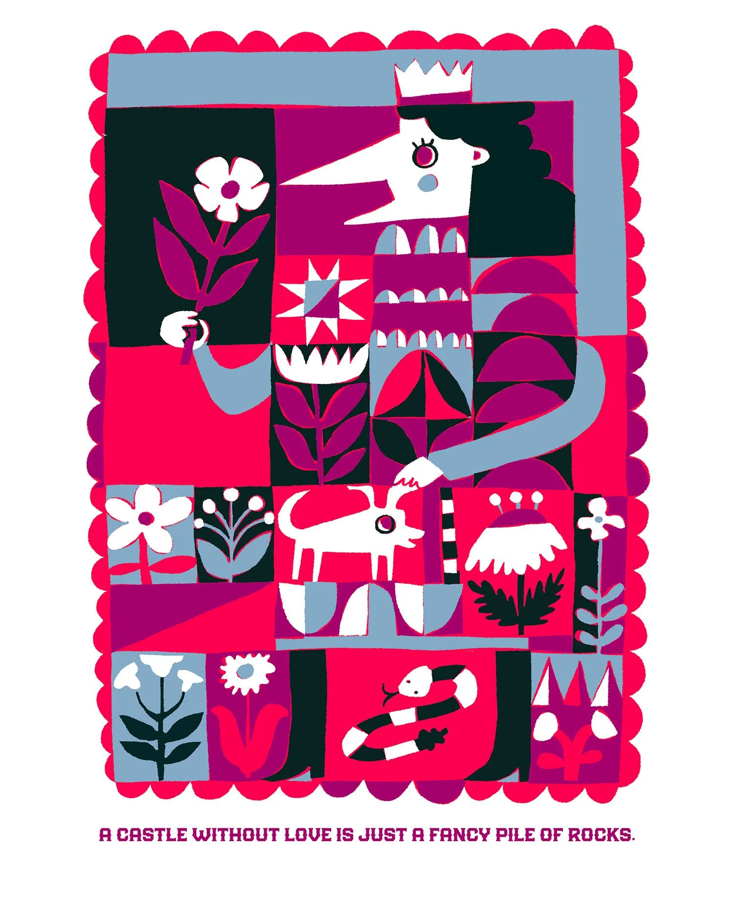
I added words!
Before, it was a prince/ss and some animals and flowers. It didn’t have a story.
With no story, this picture is: An effete spoiled child
With a story, this picture is: An ironically non-materialistic rich person, with a respect for life and connection
Putting good text at the bottom of your illustration makes people have to look twice. There’s a cursory-glance, then reading, then the person looking back with new insight.
I feel pretty good about that summation!
So much so that it gets to be bigger and have a button under it!
Oooh la la.
Other final steps:
I swapped palettes. Again.
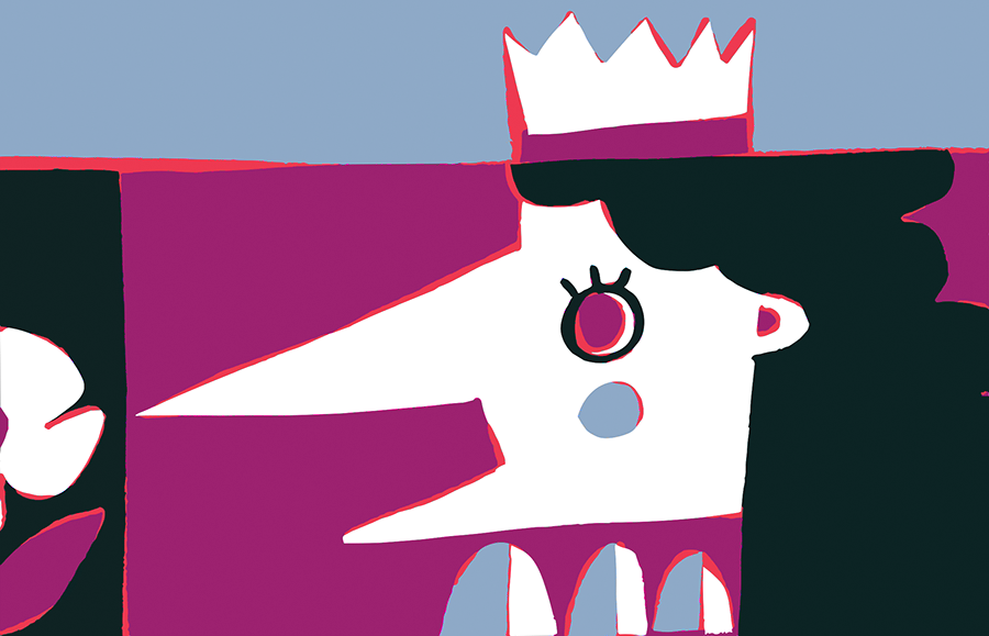
Finally, I tweaked the illustration. I pulled out each color, re-drew it individually, and re-layered the now-mismatched pieces. If you look closely, you’ll see wobblyness.
I think it looks kind of like an off-kilter screen print.
If you want to try this at home, please note:
It takes forever.
You would only ever want to do it on an illustration with very limited & discrete colors.
But if you zoom in really close, you can see that the discrepancies make it beautiful (to me anyway):
Thanks for reading, art friends! If you want more cool shit like this delivered warm and fresh to your inbox, subscribe to my substack!
